Seems like every day we stumble onto a new Google Pigeon test bucket. Here’s a desktop SERP for “ft. lauderdale movers” that looks pretty mobilicious:

When you click on the “More movers” link (which had disappeared in a lot of post-Pigeon SERPs), you get another mobile-looking ordered list:
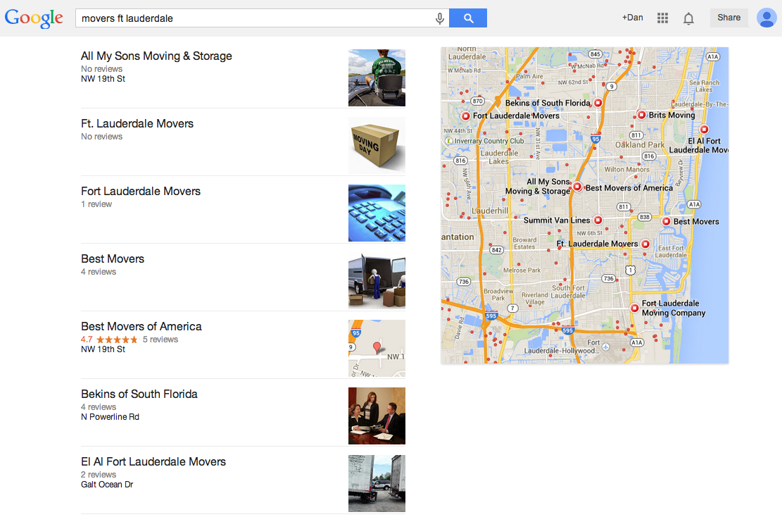
And of course it’s full of Pigeon Poop SPAM.
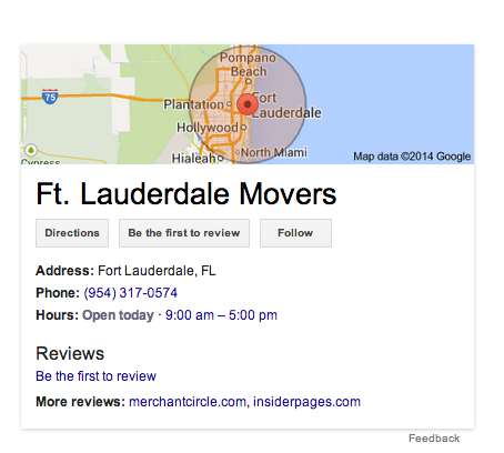
We’re also seeing a service radius in the Knowledge Graph box for one of the listings. Don’t recall seeing that before: (As Linda points out in the comments, this has been around for a while. Didn’t have my coffee yet when I posted.)
Anyone else seeing these or other variations?
*Update –
When you click on one of the tiles in the pack it does a branded + geo search like in the screenshot below:
7 Response Comments
Great catch Andrew!
That top one is new to me and I can’t replicate, so you must be sitting on the golden datacenter.
But service area radius in the KP has been around for quite awhile. I 1st started seeing it maybe 8 months or so?
I see so many variants, I can’t recall from one day to the next
I’ve also noticed that service area radius balloon. I haven’t seen it on too many searches, only one or two, but it’s pretty cool! I’ve also notice that Google seems to be thinning the local pack even more. For some reason, it seems to be popping up less and less again. Have you noticed the same?
I don’t know that we are seeing it any less often. But it does seem to be kind of random.
We aren’t getting this yet in the UK, unless I am looking in the wrong place…
I’m not getting it in the UK either, maybe we’re next on the list?
Seems like the U.S. is the testing ground for this stuff. Not seeing it anymore though.